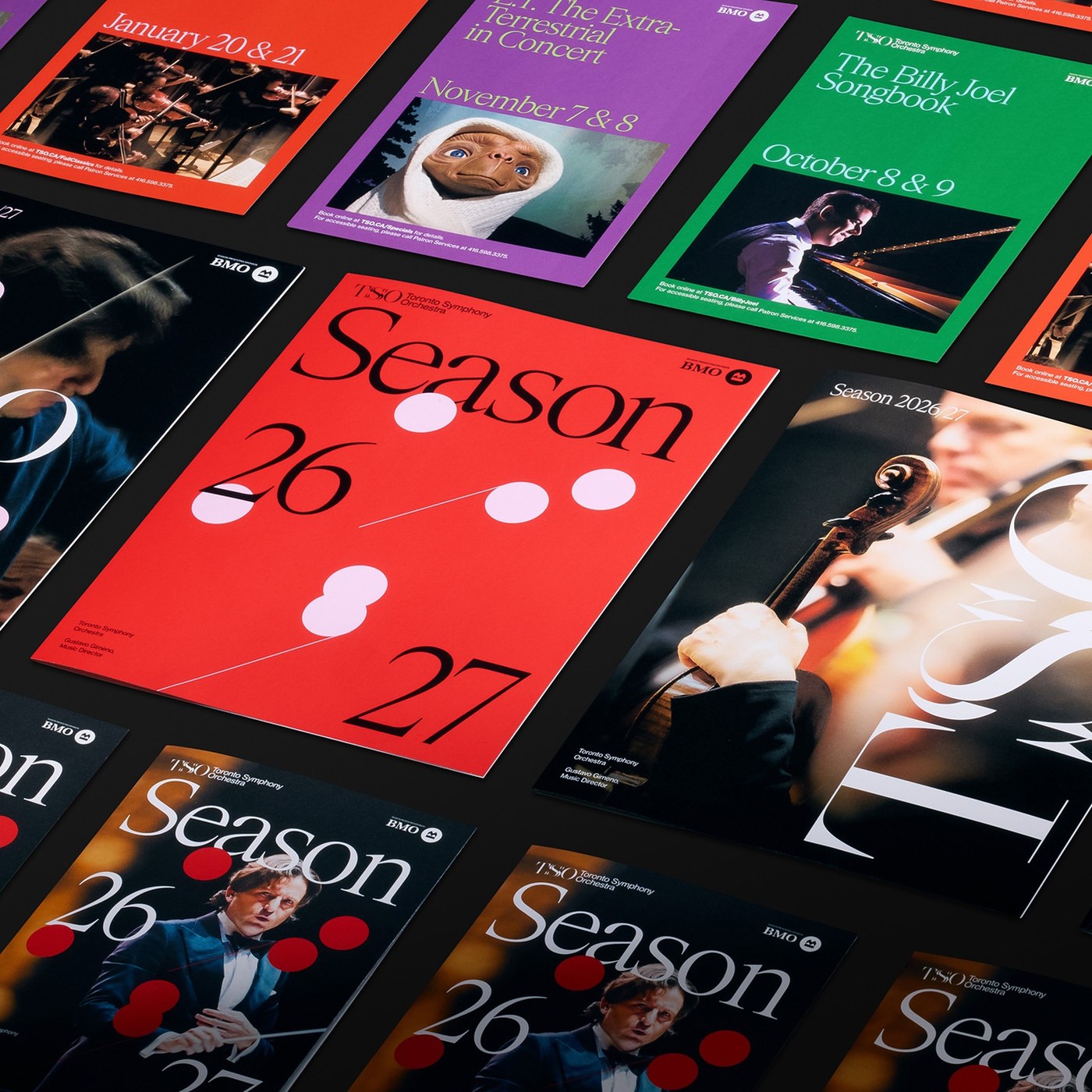
Underline Studio anchors its graphic design for the Toronto Symphony Orchestra around an echoing serif S and color-coded season print.
T and O donât budge in the new Toronto Symphony Orchestra monogram, while the central S splits into echoed crescents and twin serif spurs. Founded in 1906 and led by Music Director Gustavo Gimeno, the 93-member ensemble asked Torontoâs Underline Studio to reimagine its identity so audiences connect more closely with live orchestral performance. Underline Studio centered the system on an animated S in âsymphonyâ that responds directly to the music being played. Frozen in white across Gimenoâs dark jacket in stage portraits by Allan Cabral, Daniel Neuhaus, and Daniel Ehrenworth, those offset double curves read like a bowed string caught mid-vibration.
Sources indicate that literal five-line sheet music doesnât appear anywhere here. Across the Season 26/27 brochure covers and chartreuse street posters, Underline Studio pairs high-contrast serif display type with flat pink and lilac ovals linked by hairline diagonal stems â turning musical phrasing into spare geometric notation. Color separates diverse programming at a glance. Signal red carries the flagship season book, emerald green frames The Billy Joel Songbook, violet backs E.T. in Concert, and vermilion marks Carmina Burana. On the crimson poster for Mozartâs Symphony No. 41 at Roy Thomson Hall, that graphic design shifts into stark asymmetry as a giant black TSO lockup climbs the right bleed opposite a small portrait of Mozart. Inside the season spreads, motion-blurred rehearsal photography gives way to a five-column lavender layout punctuated by red circular stat badges.
Smaller concert hall pieces keep that rotated vertical spine intact. Itâs a crisp anchor for narrow formats. Printed white Roy Thomson Hall tickets for Mendelssohnâs Italian Symphony lock the vertical TSO mark along the left stub beside tabular row, section, and balcony seat markers. A matte-black bookmark repeats that vertical orientation in white ink above compact sans-serif naming, while natural canvas totes drop the black monogram flush against the bottom hem. Donor folders from TSO Friends to the Impresarios Club arenât uniform either; dark concert photography carries neon-pink, orange, and green fore-edge stripes so the graphic design holds its rhythm from street posters down to a ticket stub.
See the full project on Underline Studioâs website.