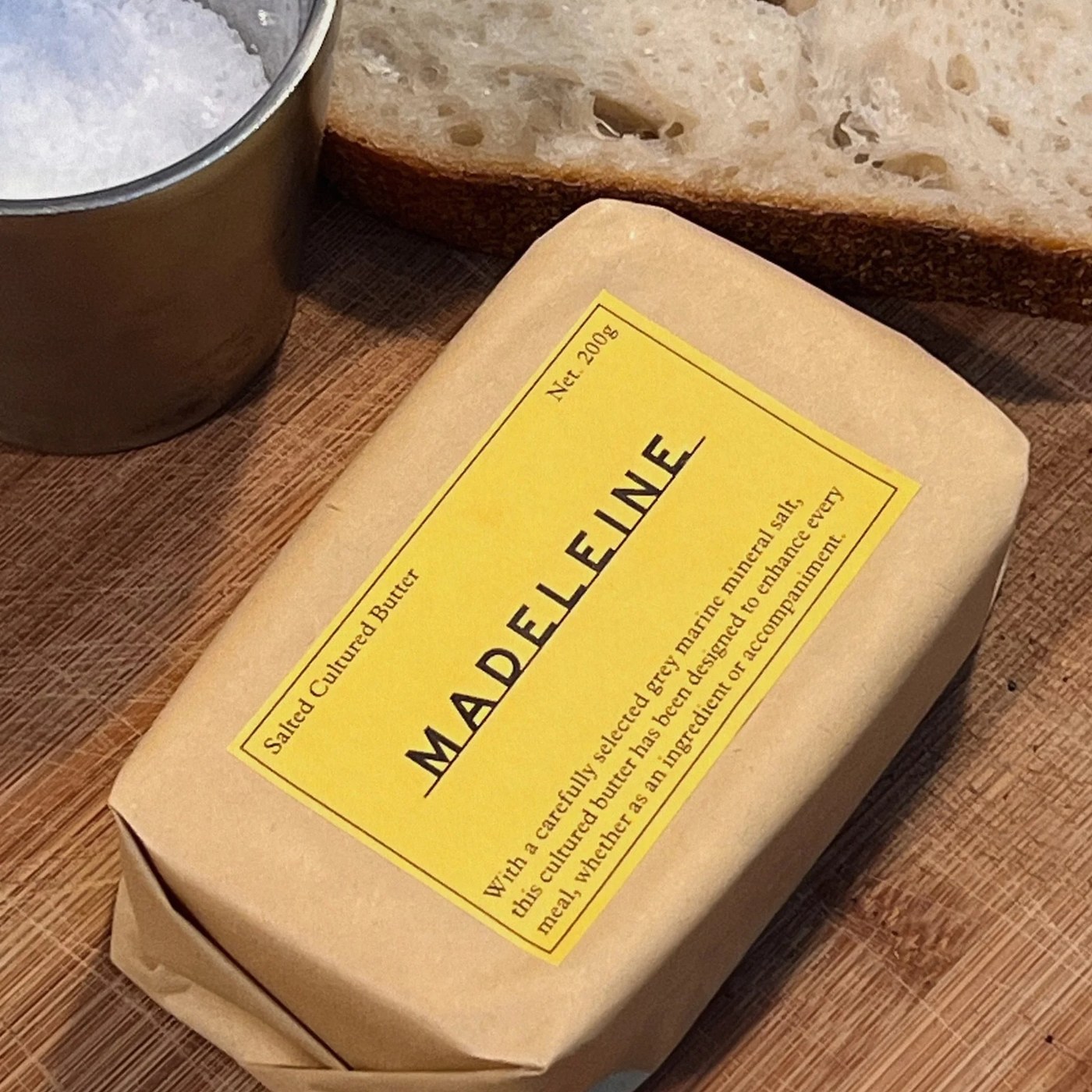
Studio Hi Ho pairs waxed brown kraft paper, butter-yellow labels, and 1948 Highway Gothic in its packaging design for Melbourneâs Madeleine.
According to founder Jack Gaffney, Melbourne butter maker Madeleine is one of just two producers in the world working with a malaxer, a traditional rotary machine that slowly kneads and folds cultured cream. Gaffney spent years in France before returning to Victoria, naming the brand after the small French cake and the habit of slowing down to eat well. Still, Studio Hi Ho director Cam Norris knew overt Parisian clichés wouldn't ring true for dairy churned in the Yarra Valley. No berets or bistro tropes here. French provenance shows up only where the product earns it, from hand-harvested grey Celtic Sel de Guérande salt to a Piment dâEspelette recipe created with chef Guillaume Brahimi.
Function dictated the outer wrapper first. Because cultured butter sticks to bare paper, Studio Hi Ho chose a brown kraft sheet waxed on one side so the block doesn't cling, letting its warm parcel tone anchor the packaging design. On the core salted and unsalted blocks, bright butter-yellow labels sit framed inside thin black rules. Tracked-out uppercase MADELEINE lettering in 1948 Highway Gothic rests directly on a continuous horizontal underline â a detail Norris likens to a stamped badge on an old French tractor. Workhorse serif Plantin handles the corner net weights, tasting notes, and the tabular Yarra Valley nutrition grid on the reverse.
White labels with colored ink separate collaborations and limited runs from the yellow core blocks. Repeat buyers spot varieties fast. On the Outback Cultured Butter label, burnt-ochre type lists bush tomato, wattleseed, and Murray River pink salt beneath a hand-drawn Limited Release script tucked under the baseline rule. Pat Rogasch drew the supporting malaxer scene with slightly blown-out ink lines on kraft paper, tucking a tiny M onto the makerâs apron. To close out the packaging design, photographer Shelley Horan and styling studio INTO IT shaped butter into cones, cubes, and spheres that leave every wooden paddle ridge visible.
See the full project by Studio Hi Ho on The Brand Identity.