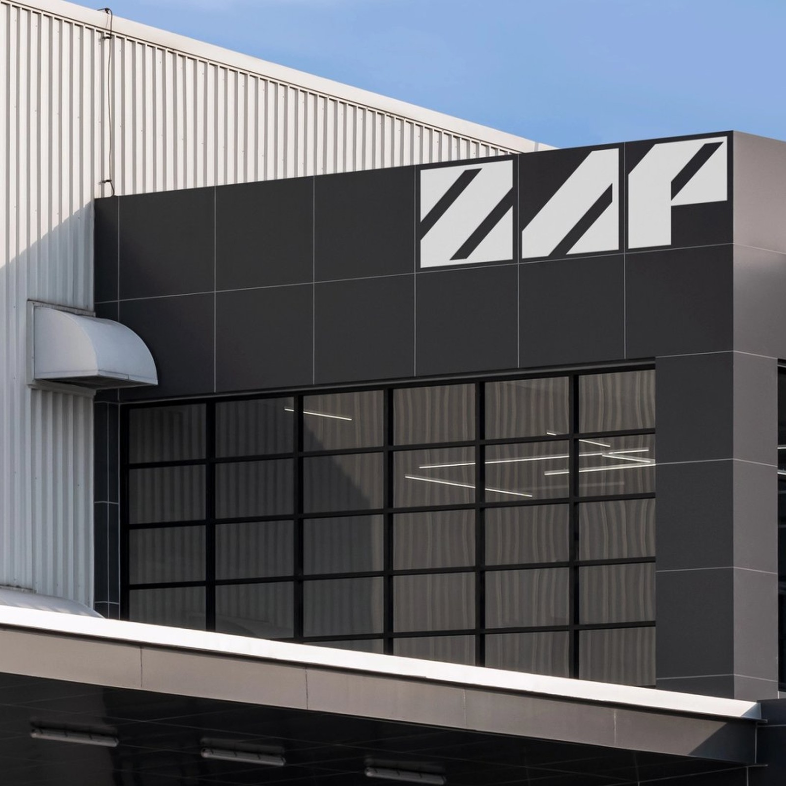
Manual builds the Zap Energy brand identity around a diagonal wordmark, electric yellow and vivid orange, for the integrated nuclear tech giant.
The wordmark is the whole event. Three thick geometric letters, each cut by the same diagonal, sit white on black or black on electric yellow, and that diagonal repeats everywhere: lime hazard stripes beside the orange Room 6 sign, slashes through the poster pattern, stacked wayfinding blades in the lab halls. The palette does the temperature work. Electric yellow and vivid orange run against black, white and bare steel, so the identity reads hot and precise at once, never corporate blue. The photography keeps it grounded in the lab itself: copper cables, steel flanges, violet plasma glowing behind round portholes.
The wordmark is custom, built from simple geometric forms, and its modular letterforms repeat into patterns that echo the scalable technology behind the company. Against it sits a distinctive technical serif, the voice of the whitepapers and the lab signage, which gives the system its precision and authority. The contrast is the point: the wordmark shouts, the serif documents. On the stationery the serif carries a full whitepaper title across the page in calm lines while the wordmark holds the top corner. The wayfinding reads at a glance across the lab halls, with lime arrows and room numbers set in the same serif.
The system lands on real surfaces. The wordmark scales to a full building facade in white on dark grey panels, and inside, orange room signs sit on lime diagonal stripes. Stacked wayfinding blades name Engineering, Meeting Rooms, FuZE-Labs, Zap South and Century Labs. The icon set draws the science in thin isometric linework: atoms, cylinders, H2 and CO2 tags. Printed pieces carry the same logic, from a framed poster reading One Nuclear Stack. Multiple Paths to Power. to a stationery suite in yellow, orange and white.
See the full Zap Energy case study from Manual.