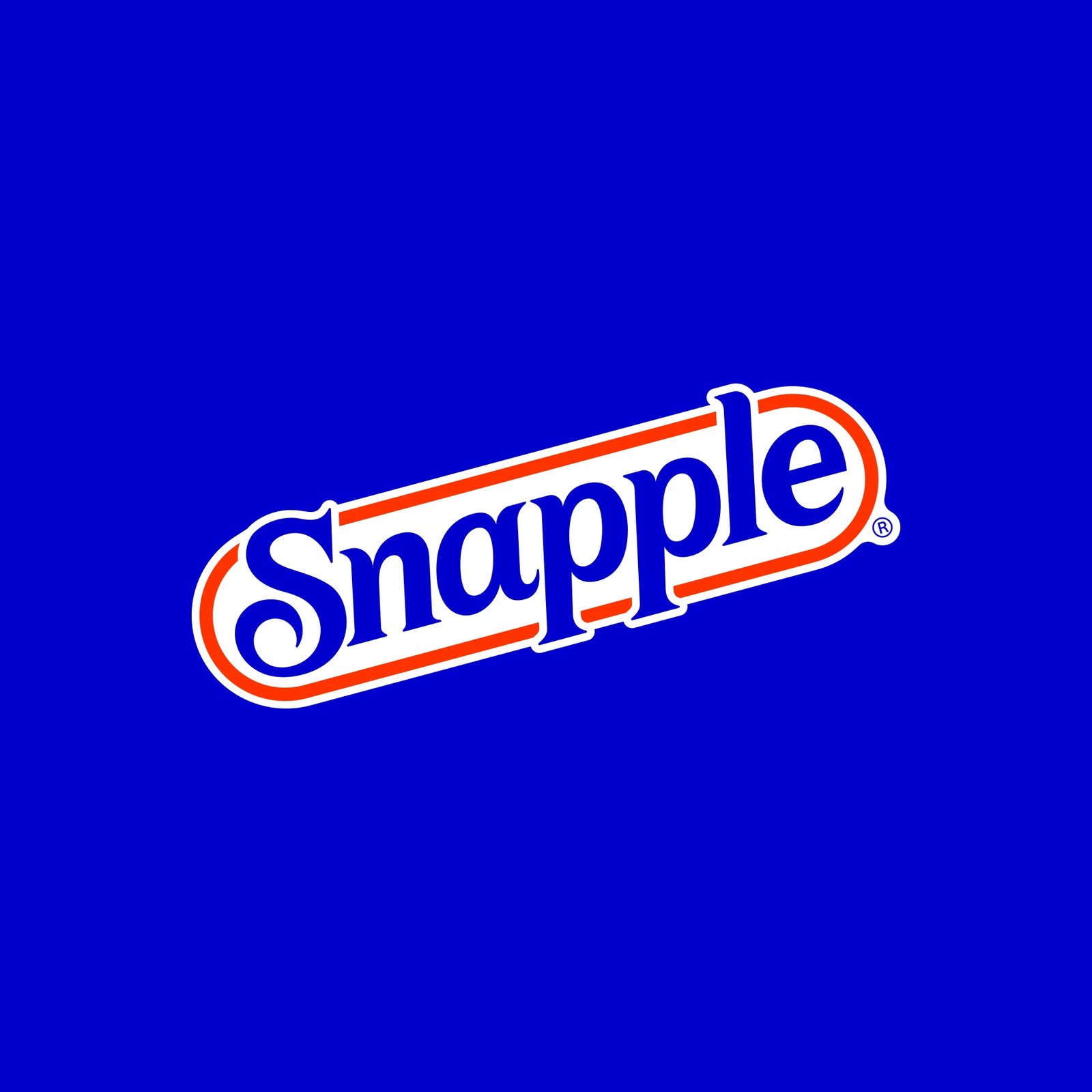
Deutsch Design restores Snapple's 90s racetrack logo in the Snapple rebrand 2026, rebuilt with custom letterforms and flavor-first packaging.
The change starts with the mark itself. The navy serif Snapple script sits tilted inside a white capsule, ringed in Racetrack Red on a field of Snapple Blue, and the whole thing reads at a glance, on a bottle or on a phone screen. The lowercase blue sans serif from the 2021 rebrand is gone, and with it the flat, generic feel that had crept in over a series of rebrands. What replaces it is warmer and louder: bolder color, higher contrast, and a shape that people who grew up with the brand recognize before they read a word.
The letterforms were drawn from zero, more geometric and less condensed than the 90s original, with the substantial curling S leading the wordmark and the strokes built to hold their weight at any scale. A construction grid reveals the mark measured out at 1X and 4X, and a second spread draws the letters as outlines with their bezier points exposed, annotated with notes on how the curves cue taste appeal. The supporting type is Cygnet CF by Connary Fagan, shown in 18 styles across 9 weights, set huge in magenta over raspberry photography.
On the bottle, each flavor gets its own world. Snapple Apple bursts across green with sliced apples and leaves, Raspberry Tea goes full magenta with whole raspberries around the bottle, and the ten-bottle lineup demonstrates the range working as one shelf, from Peach Tea to Orangeade. The fruit is shot big and close, so the taste feels immediate before a single word is read.
The palette is specced out in full: Snapple Blue at #10079E, Snapsolutely Blue at #004EE0, Racetrack Red at #E10800, and Zero Sugar White, each with hex, RGB, CMYK and PMS values. Real Tea and Real Juice badges sit on the labels, and the headline says it plain: Sometimes you just want a drink that tastes good.
It has been revealed that the rebrand was led by Deutsch Design in Los Angeles, with Adhemas Batista as chief design officer and Erica Park as group design director. See more from Deutsch Design on Behance.