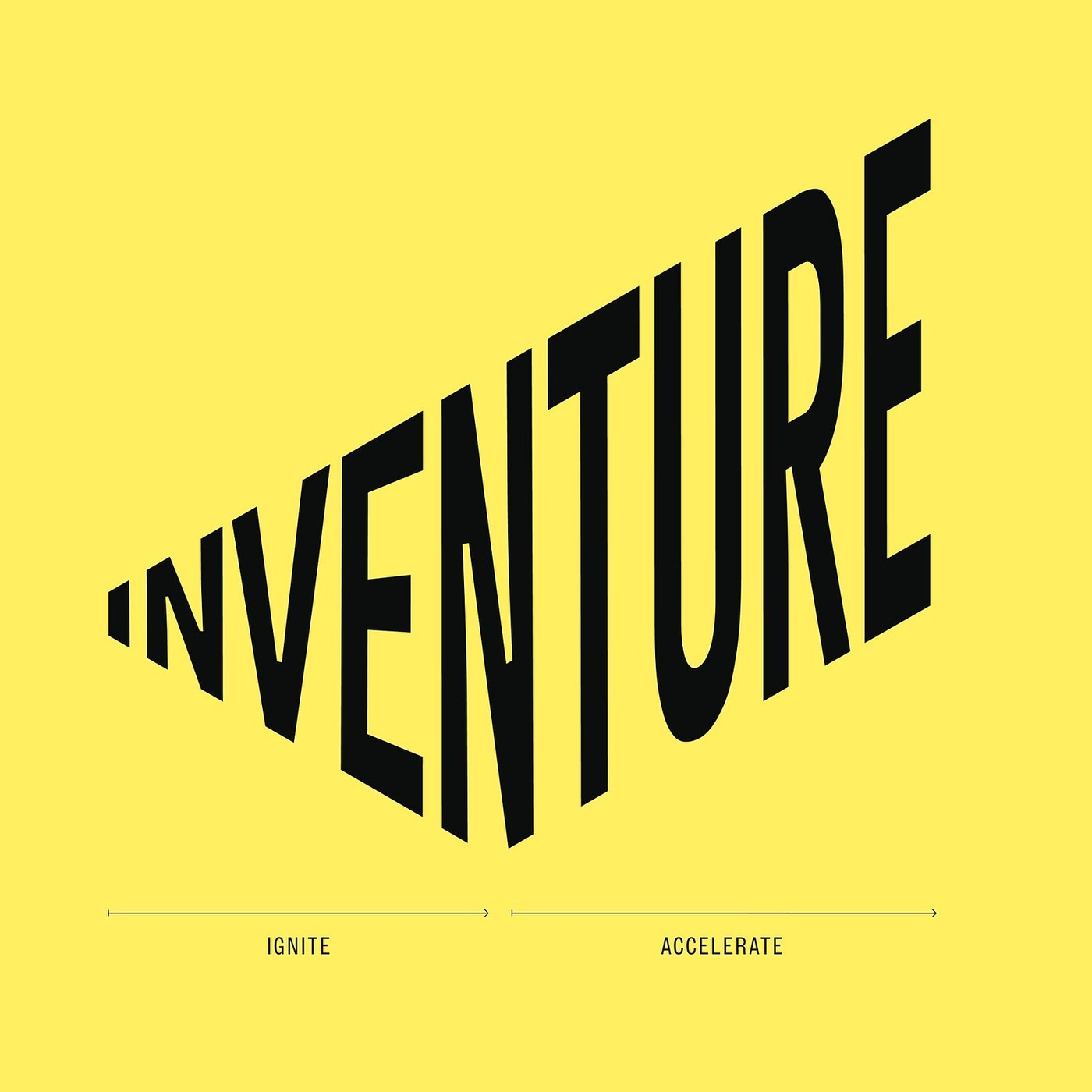
Stockholm studio Bedow builds its branding for Nordic venture firm Inventure around a two-part wordmark and 30-degree slanted headlines.
Halfway through the INVENTURE logotype, the bottom edge stops dropping and climbs. After twenty years backing startups across Finland, Sweden, the Baltics, and the UK, the Nordic venture firm asked Stockholm studio Bedow to sharpen its focus toward fewer, stronger portfolio companies under a âDare to winâ direction. Bedow translated the narrative âIgniting the Few. Accelerating the Many.â directly into the wordmarkâs geometry. Itâs two movements in nine letters. From the tiny left-hand I to the central N, the letterforms flare open inside a 60-degree wedge like a spark catching, before TURE locks height and climbs at a 30-degree angle.
Recent findings suggest that regular italics lean their stems to the right, yet Bedow keeps every vertical stroke plumb. On the type specimen sheet, Varp Slim Super Slanted pairs a 30-unit slant with a 30-degree counterclockwise rotation â covering full Baltic diacritics from Ä to Ų so headlines climb across the grid without tipping over. Calm, upright serif copy grounds that upward pull. Color across the branding stays just as tight, pairing Ignite Red (#FF4E10), Pink Grey (#FCF3ED), and Spark Yellow (#FFEF61) either as razor-cut diagonal planes or diffused flame gradients behind founder portraits. Nothing blurs the cut.
That same 30-degree slice organizes every screen and slide without needing secondary icons. Across the portfolio grid, vertical photography for Lithuaniaâs Biomatter, Finlandâs Wolt, and Swedenâs Lassie breaks along parallel diagonal ledges where condensed firm names climb out of Pink Grey and Ignite Red blocks. In the interactive archive loop, a dense wall of over a hundred backed startups lights up one name at a time in red on hover. Pitch slides tuck the wordmark into the bottom-left corner beside serif â¬1â3 million ticket copy, while social cards crop just the expanding INV wedge into a square avatar. Even on an exterior office window, the black vinyl branding doesnât need a tagline; the upward step of the letters carries the momentum against reflected brick facades.
See the full project on Bedowâs website.