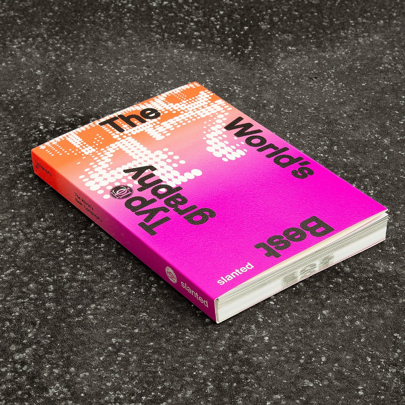
Slanted Publishers and the Type Directors Club reshape Typography 47 with a 17 Ã 24 cm thread-stitched editorial design and changing papers.
For the 47th edition of The Worldâs Best Typography, edited by Griffin McCabe, Joe Newton, and the Type Directors Club, creative directors Lars Harmsen and Marian Misiak alongside Pola MaÅaczewska and Slanted Publishers trimmed the book down to a 17 Ã 24 cm softcover. It's a practical shift away from heavy coffee-table monuments. Even at 384 pages, the compact footprint and lower price point turn the annual into a working desk manual covering communication design, lettering, and typeface design from over seventy years of TDC competitions.
Looking at the cover in the opening shots, a white halftone dot matrix forms an oversized "47" across a fluorescent orange-to-magenta gradient, while the words "The Worldâs Best Typography" rotate around all four edges so there's no single upright orientation. In the close-up of the inner foldout, the binding sits completely exposed: red thread zigzags across black spine marks, allowing thick signatures to lie flat on a table without snapping shut. That construction supports the book's changing paper stocks, shifting between coated plates for full-color winners and tactile, toothy pages for the index and commentary.
Wayfinding carries the real load across a 384-page compendium. Keeping long credit blocks off the visual spreads, the editorial design pairs each entry â like the contrasting white-and-black spread of Studio Dumbar/DEPT's DEMO 2025 identity and The New York Times Magazine (22 â 216 CD), with a compact directional code at the foot of the page. Those arrows point straight to the back-of-book index and the Judgesâ Choices section, where jurors unpack specific winners above scannable QR codes. Down at the bottom trim of pages 318 and 319, heavy black numerals bleed right off the paper edge, painting a graphic stripe across the closed fore-edge.
See the full project on Slanted Publishersâs website.